 |
| Layout CheatSheet |
Hello everyone,
Today I wanted to prepare a content for you that is easy to understand, enriched with visual examples and contains pill information about how to place our widgets on the UI screen in flutter. I hope it will be useful for all of us.
1. Main Layout Widgets
Column
Purpose: To sort widgets vertically.
Area of Usage: Used when creating a list or when a vertical arrangement is needed. For example, it is useful when designing a form or a profile page.
Parameters:
mainAxisAlignment: Sets the alignment on the vertical axis.
crossAxisAlignment: Sets the alignment in the horizontal axis.
Tip: Column is a structure considered as flex. The widgets placed in it fill the available space and you can control how this space is allocated by using Expanded or Flexible.
Column(
 mainAxisAlignment: MainAxisAlignment.center/end/spaceAround/spaceBetween/spaceEvenly/start,
 children: [
   Icon(Icons.home, size: 100, color: Colors.amber),
   Icon(Icons.home, size: 100, color: Colors.teal),
   Icon(Icons.home, size: 100, color: Colors.blueAccent),
  ],
 ),
Column(
  crossAxisAlignment: CrossAxisAlignment.center/end/start/stretch,
  children: [
    Icon(Icons.home, size: 100, color: Colors.amber),
    Icon(Icons.home, size: 200, color: Colors.teal),
    Icon(Icons.home, size: 100, color: Colors.blueAccent),
  ],
),
Row
Purpose: Sorting widgets horizontally side by side.
Area of Usage: It is used when icons and text should be displayed side by side. For example, in an application bar (AppBar) icons and text are usually organised with Row.
Parameters:
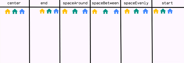
mainAxisAlignment:Sets the alignment in the horizontal axis.
crossAxisAlignment: Sets the alignment on the vertical axis.
Tip: Row provides horizontal space for child widgets. If the elements are too wide, overflow may occur. In this case, it may be necessary to use Expanded or Flexible.
Row(
  mainAxisAlignment: MainAxisAlignment.center/end/spaceAround/spaceBetween/spaceEvenly/start,
  children: [
    Icon(Icons.home, size: 100, color: Colors.amber),
    Icon(Icons.home, size: 100, color: Colors.teal),
    Icon(Icons.home, size: 100, color: Colors.blueAccent),
  ],
),
Row(
  crossAxisAlignment: CrossAxisAlignment.center,
  children: [
    Icon(Icons.home, size: 100, color: Colors.amber),
    Icon(Icons.home, size: 200, color: Colors.teal),
    Icon(Icons.home, size: 100, color: Colors.blueAccent),
  ],
),
Stack
Purpose: Widget’ları üst üste yığmak.
Area of Usage: It is often used in situations that require z-index control, that is, when one widget needs to be overlaid on top of another. For example, it can be used to add text over an image.
Parameters:
Positioned: It is used to place the child widget in a specific position. The position can be set with parameters such as top, left, right, bottom.
Tip: Stack offers both flexibility and complex arrangements. With the Align or Positioned widgets, elements can be aligned or positioned at specific points.
Stack(
  children: [
    Container(color: Colors.blue, width: 100, height: 100),
    Positioned(
      top: 10,
      left: 10,
      child: Icon(Icons.star, color: Colors.white),
    ),
  ],
);
2. Flexible Layout Widgets
Expanded
Purpose: Filling the entire available space or covering a flexible area.
Area of Usage: It is usually used in Row or Column to allow a widget to fill the remaining space. For example, you can use it for a button that you want to completely cover the width of the screen.
Parameters:
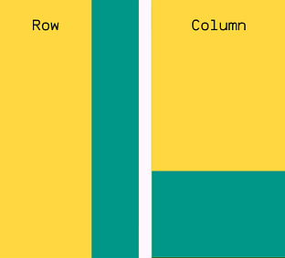
flex: When there is more than one Expanded widget, determines the proportion of space to allocate to each.
Tip: Expanded flexibly shares the space in a Row or Column with other elements. This sharing ratio can be set with the flex parameter.
Row/Column(
  children: [
    Expanded(flex: 2, child: Container(color: Colors.amberAccent)),
    Expanded(flex: 1, child: Container(color: Colors.teal)),
  ],
),
Flexible
Purpose: It is used for a widget to fill the available space, but for this space to be flexible.
Area of Usage: It is used when a widget needs to occupy a certain area, but this area can be further expanded or contracted.
Parameters:
fit: FlexFit.tight(takes up all space like Expanded) or FlexFit.loose (takes up only as much space as it needs).
Tip: Flexible offers more controlled flexibility than Expanded. How much space it will occupy can be determined with the fit parameter.
Row/Column(
  children: [
    Flexible(child: Container(color: Colors.green, height: 100)),
    Flexible(fit: FlexFit.loose, child: Container(color: Colors.yellow, height: 160)),
  ],
),
3. Box Widgets
Container
Purpose: Used to stylise a widget, add padding, margin and decoration.
Area of Usage: It is often used to control the style and size of a widget. It is an ideal choice for adding a shadow over an image or positioning a text in a specific area.
Parameters:
padding: The space from the edges of the content.
margin: The space from the outside.
decoration: Used to add a background colour, border or shadow.
Tip: Container provides styling and editing control. It is used to control the style and position of the widget placed inside it.
Container(
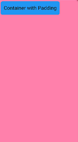
  padding: const EdgeInsets.all(16.0),
  margin: const EdgeInsets.all(8.0),
  decoration: BoxDecoration(
    color: Colors.blue,
    borderRadius: BorderRadius.circular(10),
  ),
  child: const Text(
    'Container with Padding',
    style: TextStyle(fontSize: 26.0),
  ),
),
SizedBox
Purpose: Determine fixed width and height.
Area of Usage: It is used to leave a fixed space between two widgets or to create a widget of a certain size.
Tip: SizedBox can be used to create a space or place visible/invisible widgets of a certain size.
SizedBox(
  width: 100,
  height: 50,
  child: Text('Sized Box',
    style: TextStyle(fontSize: 26.0),
  ),
),
Padding
Purpose: Adding space around a widget.
Area of Usage: It is used when the content needs to be at a certain distance from the edges. For example, you can use it to add space to a button from the inside.
Tip: Padding, like Container, is a style widget optimised for adding padding only.
Padding(
  padding: EdgeInsets.all(16.0),
  child: Text(
    'Padded Text',
    style: TextStyle(fontSize: 26.0),
  ),
),
Align
Purpose: Aligning a widget to a specific position.
Area of Usage: It is used when it is necessary to place the widget at a specific point within an area. For example, Align can be used to align a button to the bottom right corner.
Tip: Align is an ideal widget for aligning widgets with unspecified width and height.
Align(
  alignment: Alignment.bottomRight,
  child: Text(
    'Aligned to Bottom Right',
    style: TextStyle(fontSize: 26.0),
  ),
),
Center
Purpose: Centring a widget.
Area of Usage: Used when a widget needs to be exactly centred vertically and horizontally.
Tip: Center is a special case of the Align widget and always puts the alignment in the centre.
Center(
  child: Text('Centered Text',
    style: TextStyle(fontSize: 26.0),
  ),
);
4. Grid Arrangements
GridView
Purpose: Organising widgets in the form of a grid.
Area of Usage: It is used where a grid arrangement is required, such as in a gallery application or product catalogue.
Parameters:
crossAxisCount: Determines how many columns horizontally.
mainAxisSpacing andcrossAxisSpacing: Adjusts the gaps between the grids.
Tip: GridView automatically places items in the grid. Using GridView.count allows you to specify a certain number of columns.
GridView.count(
  crossAxisCount: 3,
  mainAxisSpacing: 10,
  crossAxisSpacing: 10,
  children: [
    Container(color: Colors.redAccent),
    Container(color: Colors.greenAccent),
    Container(color: Colors.blueAccent),
  ],
),
GridView.builder
Purpose: Creating dynamic and performance-friendly grid layouts.
Area of Usage: It is used to improve performance when working with large data sets. For example, a product list with infinite scrolling.
Tip: GridView.builder does not render widgets that are not on the screen, thus improving performance.
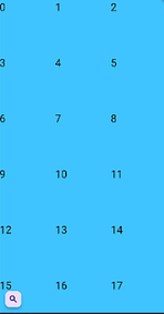
GridView.builder(
  gridDelegate: const SliverGridDelegateWithFixedCrossAxisCount(
    crossAxisCount: 3),
  itemBuilder: (context, index) {
    return Container(
      color: Colors.lightBlueAccent,
      child: Text(
        '$index',
        style: const TextStyle(fontSize: 26.0),
      ),
    );
  },
),
5. List Arrangements
ListView
Purpose: Organising widgets into a vertical list.
Area of Usage: Used when a simple listing is required. For example, it is ideal for listing messages in a chat application.
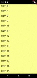
Tip: ListView can show a large number of items by scrolling. ListView.builder may be preferred for performance.
ListView(
  children: const [
    ListTile(
      title: Text(
        'Item 1',
        style: TextStyle(
          fontSize: 26.0,
          color: Colors.red,
        ),
      ),
    ),
    ListTile(
      title: Text(
        'Item 2',
        style: TextStyle(
          fontSize: 26.0,
          color: Colors.blue,
        ),
      ),
    ),
  ],
),
ListView.builder
Purpose: Creating a performant and dynamic list.
Area of Usage: It is used when working with large data sets or where items are generated dynamically. For example, an infinite scroll list.
Tip: ListView.builder renders only the items visible on the screen, which significantly improves performance.
ListView.builder(
  itemCount: 20,
  itemBuilder: (context, index) {
  return ListTile(
    title: Text(
      'Item $index',
      style: const TextStyle(fontSize: 26.0),
      ),
    );
  },
),
ListView.separated
Purpose: To add a dividing line between list items.
Area of Usage: Used for lists that require separated items. For example, a contact list in a contacts application.
Tip: ListView.separated inserts a specific widget between each item, usually Divider is used.
ListView.separated(
  itemCount: 10,
  separatorBuilder: (context, index) => const Divider(
    thickness: 2.0,
  ),
  itemBuilder: (context, index) {
    return ListTile(title: Text('Item $index'));
  },
),
6. Other Useful Widgets
Spacer
Purpose: To add a space between two widgets.
Area of Usage: Used to leave a space between two widgets in Row or Column.
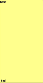
Tip: Spacer behaves like Expanded, but balances the space within a Row or Column relative to other elements.
Column(
  children: [
    Text(
      'Start',
      style: TextStyle(fontSize: 26.0, fontWeight: FontWeight.bold),
    ),
    Spacer(),
    Text(
      'End',
      style: TextStyle(fontSize: 26.0, fontWeight: FontWeight.bold),
    ),
  ],
),
Wrap
Purpose: Wraps horizontally or vertically compressed widgets, moving to the bottom row in case of overflow.
Area of Usage: It is used in cases where elements that do not fit horizontally need to move to the bottom line. For example, tag (chip) widgets.
Tip: Wrap provides a flexible layout and automatically switches to a new row when widgets do not fit on the row.
Wrap(
  spacing: 18.0,
  runSpacing: 14.0,
  children: [
    Chip(label: Text('Chip 1')),
    Chip(label: Text('Chip 2')),
    Chip(label: Text('Chip 3')),
  ],
),
AspectRatio
Purpose: To give the widget a specific aspect ratio.
Area of Usage: Used when images or videos need to be displayed with a specific aspect ratio. For example, a video player window.
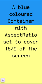
Tip: AspectRatio calculates the width and height according to the given ratio, thus ensuring layout consistency.
Scaffold(
  backgroundColor: Colors.yellowAccent.shade100,
  body: AspectRatio(
     aspectRatio: 16 / 9,
     child: Container(color: Colors.blue),
  ),
),
I hope you like this content I have prepared for Layout management in Flutter.
Have a good work.
Selin.
Hiç yorum yok:
Yorum Gönder