UI UX etiketine sahip kayıtlar gösteriliyor. Tüm kayıtları göster

2025 UI/UX Design Trends with Flutter: Develop Future Apps Now!


Hello everyone. Now that December is here, we can start preparing for 2025. The year 2025 continues to increase users’ expectations from their digital experiences. In this period when technology is advancing rapidly, catching the prominent design trends in Flutter projects will be critical for both user satisfaction and competitive advantage. That’s why I wanted to touch on this topic. Here are the trends you should pay attention to in 2025 and ways to implement them with Flutter!

1. Minimalist Designs

Uncomplicated, simple and functional designs will be at the forefront in 2025. Users place more value on fast and straightforward experiences.

How to do it?

  • Create a modern and simple look using Material 3. Material Design offers tools for minimalist UI trends.
  • The use of whitespace is critical to emphasize important information. Keep it simple by removing unnecessary elements.
  • Avoid unnecessary animations: Simplify the user experience by focusing on core functionality.

2. Dark Mode and Dynamic Colors

Users prefer dark theme and dynamic color options to reduce eye strain and have a customizable experience.

How to do it?

  • ThemeData: You can easily add light and dark theme support in Flutter.
  • FlexColorScheme Package: You can use it to create dynamic and customizable color palettes.
  • User Preferences: Store theme preferences with local storage solutions like Hive and set them automatically the next time the app is launched.
  • Adaptive Themes: Go beyond Light/Dark mode and offer different personalized themes.

3. Micro Animations and Interactive Details

Micro-animations increase user engagement within the app and play a big role in guiding them.

How to do it?

  • Hero Widget: Improve user experience by providing smooth animations on page transitions.
  • AnimatedContainer: Add simple, but effective animations.
  • Lottie: A great tool for creating lightweight JSON-based animations!
  • GestureDetector: You can add animations to users’ gestures, such as taps or swipes, using it to increase micro-interactions.
  • Implicit Animations: Add simple animations with AnimatedOpacity and AnimatedContainer.

4. Custom UX (Custom UX)

When users personalize their app experience, it increases their loyalty. Leaving settings such as language, theme and content under user control is a big advantage.

How to do it?

  • User Data: Track and analyze (with permission) to provide personalized recommendations.
  • Settings Menu: Add options to customize language, theme and content preferences.
  • State Management: You can easily manage personal settings with state management tools like Provider or Riverpod.

5. Modular and Reusable Designs

Component-based modular designs allow developers to work faster and more efficiently. Reusable components make it easier to create a consistent UI.

How to do it?

  • Custom Widgets: You can develop and reuse frequently used UI components as custom widgets.
  • Atomic Design: Increase modularity by dividing the interface into parts like atoms, molecules, organisms, etc.
  • Widget Widget Library: You can create a widget library for all components to be used in the project.

6. Data-Driven Design

Insights from user data help you make better design decisions. Data-driven UX gives you a better understanding of users’ needs.

How to do it?

  • Analytical Tools: Analyze user behavior with tools like Firebase Analytics.
  • Flutter Charts: A popular package you can use to visualize data.
  • User Testing: Compare different interfaces with A/B testing to determine the best result.

7. Desktop and Web Compatibility

Flutter’s desktop and web support is getting stronger. Designs optimized for these platforms expand the user base.

How to do it?

  • Responsive Design: Using LayoutBuilder and MediaQuery, you can design interfaces that adapt to different screen sizes.
  • Platform Control: You can make platform-specific adjustments with parameters such as kIsWeb.

8. Artificial Intelligence (AI) Powered Personalization

Thanks to AI and machine learning, it is becoming more possible and expected to deliver personalized experiences by analyzing users’ behavior.

How to do it?

  • AI/ML Packages: Integrate with TensorFlow Lite or Google AI services in Flutter.
  • State Management: Use state management solutions like Riverpod or Provider for dynamic recommendations by tracking user behavior.
  • Personal Dashboards: Create personal interfaces that change according to users’ preferences.
  • Machine Learning: Add simple AI features using TensorFlow Lite.
  • Chatbot Integrations: Develop intelligent chatbots that answer user questions.

9. Immersive Experience

Augmented Reality (AR) and virtual reality (VR) applications are set to revolutionize user interaction. In 2025, immersive experiences will become even more prominent.

How to do it?

  • AR/VR Support: With Flutter, you can integrate with technologies like ARCore or ARKit and use AR in gaming or educational applications.
  • 3D Animations: Create immersive 3D animations with tools like Rive or Flame.
  • Voice Commands: Develop interfaces based on voice commands to increase user interaction.

10. Typography and Icon Usage

Large, eye-catching typography is increasingly used to convey information quickly. And icons are increasingly preferred over text.

How to do it?

  • Google Fonts: Add modern fonts to your app.
  • Custom Icons: Enrich the interface with user-friendly icon sets.

11. Güvenlik Odaklı Tasarımlar (Security-First UX)

Protecting user data will be one of the most important design focuses of 2025. Security-based design, transparency and user control are at the forefront.

How to do it?

  • Authentication: Set up secure login systems using Firebase Authentication.
  • Privacy Settings: Design custom settings pages where users can manage data sharing.
  • Encryption: Enable encryption options in packages like Hive for data security.

Conclusion: Be Future Ready for 2025 with Flutter!

With Flutter, you can integrate 2025 design trends into your projects and offer your users an impressive, modern and future-ready experience that meets their expectations. Discover many innovations from minimalism to AR technologies, build the applications of the future today and be one step ahead in 2025!

Thank you for reading.

Selin.
Flutter ile 2025 UI/UX Tasarım Trendleri: Geleceğin Uygulamalarını Şimdi Geliştir!


Herkese merhaba. Artık Aralık ayına da girdiğimize göre 2025'e hazırlanmaya başlayabiliriz. 2025 yılı, kullanıcıların dijital deneyimlerinden beklentilerini artırmaya devam ediyor. Teknolojinin hızla ilerlediği bu dönemde, Flutter projelerinde öne çıkan tasarım trendlerini yakalamak hem kullanıcı memnuniyeti hem de rekabet avantajı açısından kritik olacak. Ben de bu sebeple bu konuya değinmek istedim. İşte 2025’te dikkat etmen gereken trendler ve Flutter ile uygulama yolları!

1. Minimalist Tasarımlar

Karmaşıklıktan uzak, sade ve işlevsel tasarımlar 2025'te ön planda olacak. Kullanıcılar, hızlı ve anlaşılır deneyimlere daha fazla değer veriyor.

Nasıl Yapılır?

  • Material 3 kullanarak modern ve sade bir görünüm oluştur. Material Design, minimalist UI trendlerine uygun araçlar sunuyor.
  • Whitespace (boş alan) kullanımı, önemli bilgileri vurgulamak için kritik. Gereksiz öğeleri kaldırarak sadeliği koru.
  • Gereksiz Animasyonlardan Kaçın: Temel işlevlere odaklanarak kullanıcı deneyimini sadeleştir.

2. Koyu Tema (Dark Mode) ve Dinamik Renkler

Kullanıcılar, göz yorgunluğunu azaltmak ve kişiselleştirilebilir deneyim yaşamak için koyu tema ve dinamik renk seçeneklerini tercih ediyor.

Nasıl Yapılır?

  • ThemeData: Flutter’da açık ve koyu tema desteğini kolayca ekleyebilirsin.
  • FlexColorScheme Paketi: Dinamik ve özelleştirilebilir renk paletleri oluşturmak için kullanabilirsin.
  • Kullanıcı Tercihleri: Tema tercihlerini Hive gibi local storage çözümleriyle saklayarak, uygulamanın bir sonraki açılışında otomatik olarak ayarla.
  • Adaptive Themes: Işık/Karanlık modun ötesine geçip farklı kişisel temalar sun.

3. Mikro Animasyonlar ve Etkileşimli Detaylar

Mikro animasyonlar, kullanıcıların uygulama içindeki etkileşimini artırır ve onları yönlendirmede büyük rol oynar.

Nasıl Yapılır?

  • Hero Widget: Sayfa geçişlerinde yumuşak animasyonlar sağlayarak kullanıcı deneyimini iyileştir.
  • AnimatedContainer: Basit, fakat etkili animasyonlar ekle.
  • Lottie: Hafif JSON tabanlı animasyonlar oluşturmak için harika bir araç!
  • GestureDetector: Mikro etkileşimleri artırmak için kullanarak, kullanıcıların dokunma veya kaydırma gibi hareketlerine animasyonlar ekleyebilirsin.
  • Implicit Animations: AnimatedOpacity ve AnimatedContainer ile basit animasyonlar ekle.

4. Kişiselleştirilebilir Deneyimler (Custom UX)

Kullanıcıların uygulama deneyimini kişiselleştirmesi, bağlılıklarını artırır. Dil, tema ve içerik gibi ayarları kullanıcı kontrolüne bırakmak büyük bir avantaj sağlar.

Nasıl Yapılır?

  • Kullanıcı Verileri: İzleme ve analiz yaparak (izin dahilinde) kişiye özel öneriler sunabilirsin.
  • Ayarlar Menüsü: Dil, tema ve içerik tercihlerini özelleştirme seçenekleri ekle.
  • State Yönetimi: Provider veya Riverpod gibi state yönetim araçları ile kişisel ayarları kolayca yönetebilirsin.

5. Modüler ve Yeniden Kullanılabilir Tasarımlar

Komponent tabanlı modüler tasarımlar, geliştiricilere daha hızlı ve verimli çalışma imkanı sunar. Tekrar kullanılabilir bileşenler sayesinde tutarlı bir UI oluşturmak kolaylaşır.

Nasıl Yapılır?

  • Custom Widgets: Sık kullanılan UI bileşenlerini özel widget’lar olarak geliştirip tekrar kullanabilirsin.
  • Atomic Design: Arayüzü atom, molekül, organizma gibi parçalara bölerek modülerliği artır.
  • Widget Kütüphanesi: Projede kullanılacak tüm bileşenler için bir widget kütüphanesi oluşturabilirsin.

6. Veri Odaklı UX (Data-Driven Design)

Kullanıcı verilerinden elde edilen içgörüler, daha iyi tasarım kararları almana yardımcı olur. Veri odaklı UX, kullanıcıların ihtiyaçlarını daha iyi anlamanı sağlar.

Nasıl Yapılır?

  • Analitik Araçlar: Firebase Analytics gibi araçlarla kullanıcı davranışlarını analiz et.
  • Flutter Charts: Verileri görselleştirmek için kullanabileceğin popüler bir paket.
  • Kullanıcı Testleri: Farklı arayüzleri A/B testi ile karşılaştırarak en iyi sonucu belirleyebilirsin.

7. Masaüstü ve Web Uyumluluğu

Flutter’ın masaüstü ve web desteği giderek güçleniyor. Bu platformlara optimize edilmiş tasarımlar, kullanıcı kitlesini genişletir.

Nasıl Yapılır?

  • Responsive Design: LayoutBuilder ve MediaQuery kullanarak farklı ekran boyutlarına uyum sağlayan arayüzler tasarlayabilirsin.
  • Platform Kontrolü: kIsWeb gibi parametrelerle platforma özel düzenlemeler yapabilirsin.

8. Yapay Zeka (AI) Destekli Kişiselleştirme

AI ve makine öğrenimi sayesinde, kullanıcıların davranışlarını analiz ederek kişiye özel deneyimler sunmak artık daha mümkün ve beklenir hale geliyor.

Nasıl Yapılır?

  • AI/ML Paketleri: Flutter’da TensorFlow Lite veya Google AI servisleriyle entegrasyon sağla.
  • State Yönetimi: Kullanıcı davranışlarını izleyerek dinamik öneriler için Riverpod veya Provider gibi state yönetim çözümlerini kullan.
  • Kişisel Dashboardlar: Kullanıcıların tercihleri doğrultusunda değişen kişisel arayüzler oluştur.
  • Makine Öğrenimi: TensorFlow Lite kullanarak basit AI özellikleri ekle.
  • Chatbot Entegrasyonları: Kullanıcı sorularını yanıtlayan akıllı chatbot’lar geliştir.

9. Sürükleyici Deneyimler (Immersive Experience)

Artırılmış Gerçeklik (AR) ve sanal gerçeklik (VR) uygulamaları, kullanıcı etkileşiminde devrim yaratmaya hazırlanıyor. 2025’te, sürükleyici deneyimler daha da ön plana çıkacak.

Nasıl Yapılır?

  • AR/VR Desteği: Flutter ile ARCore veya ARKit gibi teknolojilere entegre olabilir, oyun veya eğitim uygulamalarında AR kullanabilirsin.
  • 3D Animasyonlar: Rive veya Flame gibi araçlarla sürükleyici 3D animasyonlar oluştur.
  • Sesli Komutlar: Kullanıcı etkileşimini artırmak için sesli komutlara dayalı arayüzler geliştir.

10. Tipografi ve İkon Kullanımı

Büyük ve dikkat çekici tipografi, bilgiyi hızla iletmek için giderek daha fazla kullanılıyor. İkonlar ise metin yerine daha fazla tercih ediliyor.

Nasıl Yapılır?

  • Google Fonts: Uygulamana modern yazı tipleri ekle.
  • Custom Icons: Kullanıcı dostu ikon setleri ile arayüzü zenginleştir.

11. Güvenlik Odaklı Tasarımlar (Security-First UX)

Kullanıcı verilerinin korunması, 2025’in en önemli tasarım odaklarından biri olacak. Güvenliğe dayalı tasarım, şeffaflık ve kullanıcı kontrolü ön planda.

Nasıl Yapılır?

  • Kimlik Doğrulama: Firebase Authentication kullanarak güvenli giriş sistemleri kur.
  • Gizlilik Ayarları: Kullanıcıların veri paylaşımını yönetebileceği özel ayar sayfaları tasarla.
  • Şifreleme: Veri güvenliği için Hive gibi paketlerde şifreleme seçeneklerini aktif et.

Sonuç: 2025 İçin Flutter ile Geleceğe Hazır Ol!

Flutter ile 2025 tasarım trendlerini projelerine entegre ederek kullanıcılarına beklentilerini karşılayan, etkileyici, modern ve geleceğe hazır bir deneyim sunabilirsin. Minimalizmden AR teknolojilerine kadar birçok yeniliği keşfet, geleceğin uygulamalarını bugünden inşa et ve 2025'te bir adım önde ol!

Okuduğun için teşekkürler.

Selin.

Unity and UI Design


Hello, in this article, I would like to share information about how to prepare the user interface in Unity and what to pay attention to.

First of all, let’s talk a little bit about what is user interface (UI). UI is the main point where a game or an application interacts with the user and it has many important roles. One of them is usability. The UI allows users to easily understand and use a game or application and perform the functions they want quickly and smoothly. Another important point is first impression. A well-designed UI ensures that users have a favourable first impression when they start using our game. This, in turn, can greatly influence the likelihood of using our game again. And the last role is the understandability of the game. A game’s UI helps players understand the game mechanics and rules. In-game menus, indicators and controls make it easier for players to explore and interact with the game world.

For these reasons, it is very necessary to design our UI screen very well in order to make our game, which we have created with a lot of effort, shine even more and reach more users.

How to Create UI Screen in Unity?

To start UI design in Unity, we first need to create a Canvas. We can think of Canvas as a container that determines how your UI elements will be positioned on the stage.

As above, we create a Canvas by right clicking on the Hierarchy section in the Unity Editor and selecting “Canvas” under “UI”. Canvas is added with EventSystem. It is used to manage event components such as buttons and sliders that we will add on this canvas.

If we are going to develop our game in 3D, we need to click on the 2D button from above while making improvements on the canvas so that the canvas will appear in full screen. If we are developing a 2D game, there is no need for this since we are already viewing in 2D mode.

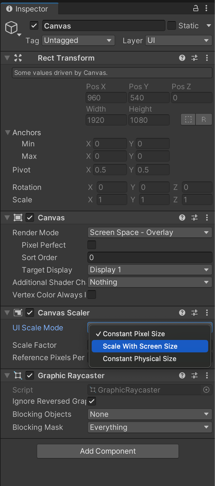
One of the most used properties in the standard Canvas Inspector is Scaler. With it, it is possible to automatically adapt UI elements to different screen sizes and resolutions. Constant Pixel Size ensures that the UI elements remain at a fixed pixel size so that the UI does not scale to different screen sizes. If we select Scale With Screen Size, UI elements are scaled according to the screen size. As the screen size increases or decreases, UI elements automatically adapt to the screen size.

UI Elements

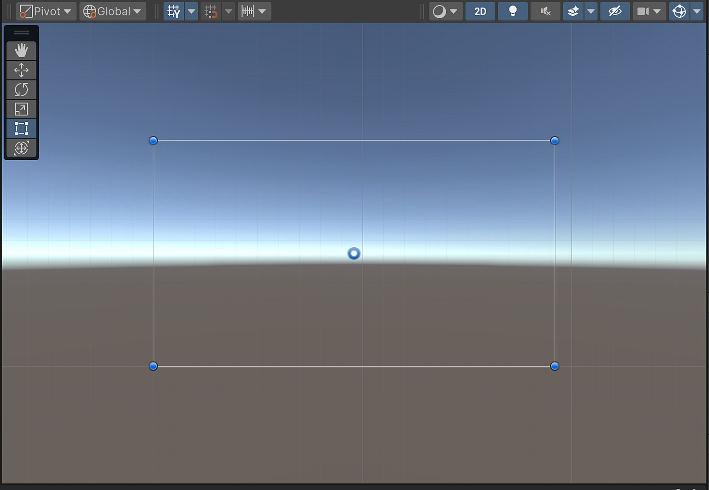
After creating our canvas, we now have an image like this on our screen and we can design and fill it as we wish:

If we think of Canvas as a frame, let’s move on to the basic UI elements that can be added to this frame.

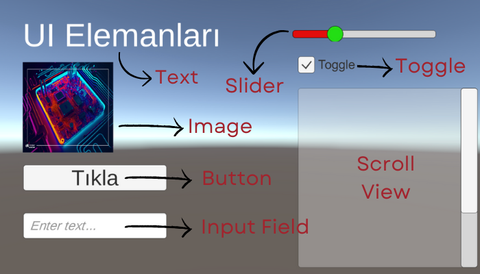
  1. Text: The Text element is used to display text on the screen. This is ideal for in-game messages, scores, game menu texts, etc. Properties such as colour, size, font, etc. can be customised.
  2. Image: The Image element is used to show visual content on the screen. This can be used for backgrounds, button icons, character portraits, etc. Properties such as texture, sprite, colour can be set. In order to add an image to the Canvas, the image file must be added to the project files. Afterwards, the image can be dragged to the Source Image section in the Inspector of the Image item or the file path can be written.
  3. Button: The button element is used for user interaction. It can be used to perform a specific action when users click it. Events can be assigned to be triggered when the button is pressed. Since text should be written on the button, it comes with the Text component. On Click() plugin is available by default. Which event will occur when the button is clicked is specified here by writing with Script.
  4. Input Field: The input field element allows the user to enter text. By default, it comes with a Text component and also a Placeholder where it can be specified what kind of information is desired. The expression to be written in this Text field can be for username and password fields, search boxes, form entries, etc.
  5. Slider: The slider element allows the user to select a value using a slider in a range of values. For example, it can be used for volume adjustment. Background, one of the components that comes by default, contains the properties related to the background of the slider bar. Fill Area contains properties that can be changed for the area where the value is increased when slid. Handle Slide contains properties related to the shape of the ball etc. used for scrolling. When it is driven with OnValueChanged event, what it will trigger can be written with Scripts.
  6. Toggle (On/Off Switch): The toggle switch element allows the user to switch an option on or off. This can be used in game settings, options menu, checkboxes, etc. By default it comes with a Background and a Label component where the switch name is entered.
  7. Scroll View: The scroll view element makes content scrollable within a given area. This can be used for long lists, text documents, loading bars, etc. The properties of the scroll areas on the right and below can be customised.
  8. Panel (Panel): The Panel element is used to group other UI elements or to create backgrounds. This can be used for menus, windows, grouping and organising. Layers can be created on the canvas. For example, let’s say we pressed the Stop Game button on the game screen. We can notify the user that the game has stopped with a panel where the screen is slightly transparent where the game is stopped.

We can see examples of these components in the screenshot below:

After adding these elements to our Canvas, we can proceed to editing. We can adjust the properties of the element we want to edit by clicking on it in Canvas or selecting it in the Hierarchy Panel. Among these properties, the most commonly used ones are position, size, rotation, colour and text content, if any.

We can create a hierarchy between these elements. In the Hierarchy section, using the drag-and-drop method, it is possible to sort them so that they are sub-elements of each other or one below the other. Or we can group them with one or more of them. Adding hierarchy in this way means that the elements are interconnected and work together.

We can also add animations to make our UI design more impressive. For example, we can play a specific animation when a button is clicked or when the mouse is moved over a text box. We can use the Animator component for this, or we can edit our UI elements with ready-made animation tools to add animations. Since the topic of animation is a very large and separate article, I am not introducing it here. I will be preparing an article about animation in the future.

Tips for a Good UI Design

1. Usability Orientated Design: When designing the user interface, it is very important to ensure that users can easily use our game. A simple, intuitive and consistent design enhances the user experience.

2. Minimalism and Cleanliness: We should avoid unnecessary complexity and excessive embellishments in the interface. A minimalist design allows users to focus and quickly find the functions they want.

3. Responsiveness and Compatible Design: Developing a design that is compatible with different screen sizes and resolutions is another important point. Responsive design allows users to have a smooth experience on different platforms from mobile devices to desktop computers. It would not be nice to say that the buttons on the right side of the screen are not visible when you open our game on a mobile phone, just play it on a tablet. :)

4. Colour Selection and Contrast: We should choose the colours carefully and use a high contrast design. In other words, when the colours in the design are compared to each other, there should be a significant difference between them. We should use colours to highlight important elements to make it easier for users to read the text, but for example, the text should not be light yellow on a UI screen where the background is white.

5. Text and Font: We need to carefully choose text sizes, fonts and layout. This is very important for the text to be readable and for users to easily understand the messages.

6. Visual Hierarchy and Layout: We can use visual hierarchy to emphasise important elements. For example, large headings, prominent buttons and other elements that need to be focused on can easily attract the attention of users.

7. Interaction and Feedback: We need to provide feedback in response to users’ actions. By providing appropriate feedback when they click buttons or fill out forms, we can ensure that users understand what they are doing. For example, if the action takes place when a button is clicked but there is no change on the screen, the user cannot be sure whether they clicked or not and a good user experience is not created.

8. Testing and Improvement: Finally, we should definitely test our design with real users and make improvements by taking feedback into account.

How to create a user interface, which elements can be added, what should be considered? I tried to explain these as much as I could. A user-oriented design is a very important issue as it will enable users to use our game more easily and enjoyably. I hope I have been useful.

Have a good work.

Selin.