Hello everyone! With this article, I would like to announce that I’m starting a “Flutter Widget of the Week” series that I think will be useful when developing Flutter projects. The first week’s widget is the CarouselView widget, which was introduced with the latest version of Flutter. I first tried to do this in my own project by adding animations to Containers. While researching, I saw that there were packages for this and I did it using a package. Now, if you have Flutter version 3.24, you can do this as a classic widget, which I think is a great convenience. Now let’s examine it in detail.
What is CarouselView?
CarouselView is a kind of slider component. That is, you can scroll and switch multiple elements (usually images or cards) horizontally or vertically. This is a very common feature in mobile apps because it allows users to easily switch between content.
How does it work?
The CarouselView widget contains a series of pages. These pages may often have a similar layout to each other, but each one offers different content. Users can switch between these pages by swiping left or right with their fingers.
Example:
Let’s say you have a news app and you want to show the most important news of the day. Each news can be a page and users can easily switch between them. This is where CarouselView comes in!
How to use?
We can think of CarouselView as a typical ListView, but it would be more accurate to describe it as working in a horizontal structure. With a few simple parameters we can start using it right away.
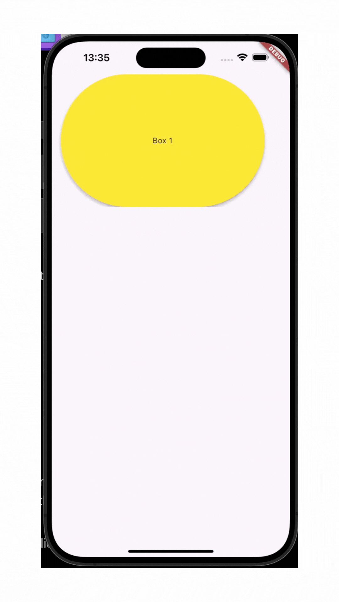
By placing the CarouselView in ConstrainedBox, we set a limit for its height.
With itemExtent we set the size of the widgets in the Carousel on the main axis. In our example, since scrollDirection is horizontal, it means that the main axis is horizontal. The 400 value we give here represents the width of the Containers. If we set this value to 200, the Containers will start to look like a narrow long column.
itemSnapping is a setting for scrolling to preserve the original layout. By default it defaults to false, which means that widgets that don’t fit on the first screen from the items to be scrolled appear to be absent but become visible when scrolled. If we change this parameter to true, according to this example, a part of the blue Container is visible on the first screen if its size is appropriate.
I didn’t use it here, but the reverse parameter also allows you to sort the items to be scrolled in reverse order.
The shrinkExtent parameter, which is not present in this example, expresses the minimum extent allowed on the main axis for widgets during scrolling. For example, let’s say we set itemExtent to 400 and shrinkExtent to 150. The Container, which is 400 wide before the scrolling starts, shrinks to a maximum of 150 units until it disappears from the screen when scrolling starts and scrolls on the screen until it disappears. By default, the value 0 is given, if no value is set, Containers can be scrolled as in the screen recording above without losing any size.
I hope you found this article useful! If you appreciate the information provided, you have the option to support me by Buying Me A Coffee!Your gesture would be greatly appreciated!
In this article, I wanted to tell you about CarouselWidget, which is presented as a novelty. I hope I was able to write clearly and understandably enough.
Herkese merhaba. Bu yazıyla Flutter projeleri geliştirirken kullanabileceğimiz, faydalı olacağını düşündüğüm “Haftanın Flutter Widget’ı” serisine başladığımı duyurmak isterim. İlk haftanın widget’ı, Flutter’ın son versiyonu ile sunulmuş CarouselView widget’ı. Ben bunu kendi geliştirdiğim projemde ilk olarak Container’lara animasyon ekleyerek yapmaya çalışmıştım. Araştırırken bununla ilgili paketler olduğunu görüp paket kullanarak yapmıştım. Şimdi ise Flutter 3.24 versiyonuna sahipseniz bunu klasik widget şeklinde yapabiliyorsunuz, bence büyük kolaylık. Şimdi gelin, detaylıca inceleyelim.
CarouselView Nedir?
CarouselView, bir tür kaydırıcı (slider) bileşenidir. Yani, birden fazla öğeyi (genellikle görseller veya kartlar) yatay veya dikey olarak kaydırabilir ve geçiş yapabilirsiniz. Bu, mobil uygulamalarda oldukça yaygın kullanılan bir özelliktir çünkü kullanıcıların içerikler arasında rahatça geçiş yapabilmesini sağlar.
Nasıl Çalışır?
CarouselView widget’ı, içinde bir dizi sayfa (page) barındırır. Bu sayfalar genellikle birbiriyle benzer bir düzen içerebilir, ancak her biri farklı içerikler sunar. Kullanıcılar parmaklarıyla sağa veya sola kaydırarak bu sayfalar arasında geçiş yapabilir.
Örneğin:
Diyelim ki bir haber uygulamanız var ve bu uygulamada günün en önemli haberlerini göstermek istiyorsunuz. Her haber bir sayfa olabilir ve kullanıcılar bu haberler arasında kolayca geçiş yapabilir. İşte burada CarouselView devreye giriyor!
Nasıl Kullanılır?
CarouselView’ı tipik bir ListView gibi düşünebiliriz ama onun yatay bir yapıda çalışanı gibi anlatırsak daha doğru olur. Birkaç basit parametre ile hemen kullanmaya başlayabiliriz.
Kodu çalıştırdığımızda aşağıdaki gibi bir ekran elde ederiz:
Notlar:
CarouselView’ı ConstrainedBox içerisine yerleştirerek yüksekliği için bir limit belirlemiş olduk.
itemExtent ile Carousel içerisine gelecek widgetların ana eksende sahip oldukları boyutu belirledik. Örneğimizde scrollDirection horizontal olduğu için ana eksen yatay olan anlamına geliyor. Burada verdiğimiz 400 değeri de Container’ların genişliğini temsil ediyor. Bu değeri 200 olarak verirsek Container’lar dar uzun birer sütun gibi görünmeye başlayacak.
itemSnapping orijinal düzeni korumak adına scrolling ile ilgili yapılacak bir ayar. Varsayılan olarak false geliyor yani kaydırılacak öğelerden ilk ekrana sığmayan widgetlar yokmuş gibi görünüyor ancak kaydırıldığında görünür hale geliyor. Bu parametreyi true olarak değiştirirsek, bu örneğe göre, ilk ekranda eğer boyutları uygun ise mavi Container’ın bir bölümü görünür oluyor.
Burada ben kullanmadım ama reverse parametresini de kaydırılacak öğeleri tersten sıralayabilmeye olanak sağlıyor.
Yine bu örnekte bulunmayan shrinkExtent parametresi de kaydırma sırasında widgetlar için ana eksende izin verilen minimum kapsamı ifade ediyor. Örneğin itemExtent’e 400 değerini, shrinkExtent’e de 150 değerini verdik diyelim. Kaydırma yapılmaya başlanmadan önce 400 genişliğinde bulunan Container kaydırma başladığında ekrandan kaybolana kadar en çok 150 birime kadar düşüyor ve o haliyle gözden kayboluncaya kadar ekranda kayıyor. Varsayılan olarak 0 değeri verilmiş, bir değer belirlemesi yapılmazsa yukarıdaki ekran kaydındaki gibi Container’lar boyutları hiç bozulmadan kaydırılabiliyor.
Bu yazımda sizlere bir yenilik olarak sunulan CarouselWidget’ı anlatmak istedim. Umarım yeterince açık ve anlaşılır yazabilmişimdir.