Hello, in this article, I would like to share information about how to prepare the user interface in Unity and what to pay attention to.
First of all, let’s talk a little bit about what is user interface (UI). UI is the main point where a game or an application interacts with the user and it has many important roles. One of them is usability. The UI allows users to easily understand and use a game or application and perform the functions they want quickly and smoothly. Another important point is first impression. A well-designed UI ensures that users have a favourable first impression when they start using our game. This, in turn, can greatly influence the likelihood of using our game again. And the last role is the understandability of the game. A game’s UI helps players understand the game mechanics and rules. In-game menus, indicators and controls make it easier for players to explore and interact with the game world.
For these reasons, it is very necessary to design our UI screen very well in order to make our game, which we have created with a lot of effort, shine even more and reach more users.
How to Create UI Screen in Unity?
To start UI design in Unity, we first need to create a Canvas. We can think of Canvas as a container that determines how your UI elements will be positioned on the stage.

As above, we create a Canvas by right clicking on the Hierarchy section in the Unity Editor and selecting “Canvas” under “UI”. Canvas is added with EventSystem. It is used to manage event components such as buttons and sliders that we will add on this canvas.
If we are going to develop our game in 3D, we need to click on the 2D button from above while making improvements on the canvas so that the canvas will appear in full screen. If we are developing a 2D game, there is no need for this since we are already viewing in 2D mode.

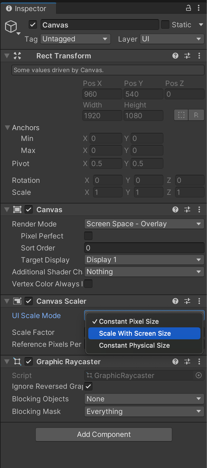
One of the most used properties in the standard Canvas Inspector is Scaler. With it, it is possible to automatically adapt UI elements to different screen sizes and resolutions. Constant Pixel Size ensures that the UI elements remain at a fixed pixel size so that the UI does not scale to different screen sizes. If we select Scale With Screen Size, UI elements are scaled according to the screen size. As the screen size increases or decreases, UI elements automatically adapt to the screen size.
UI Elements
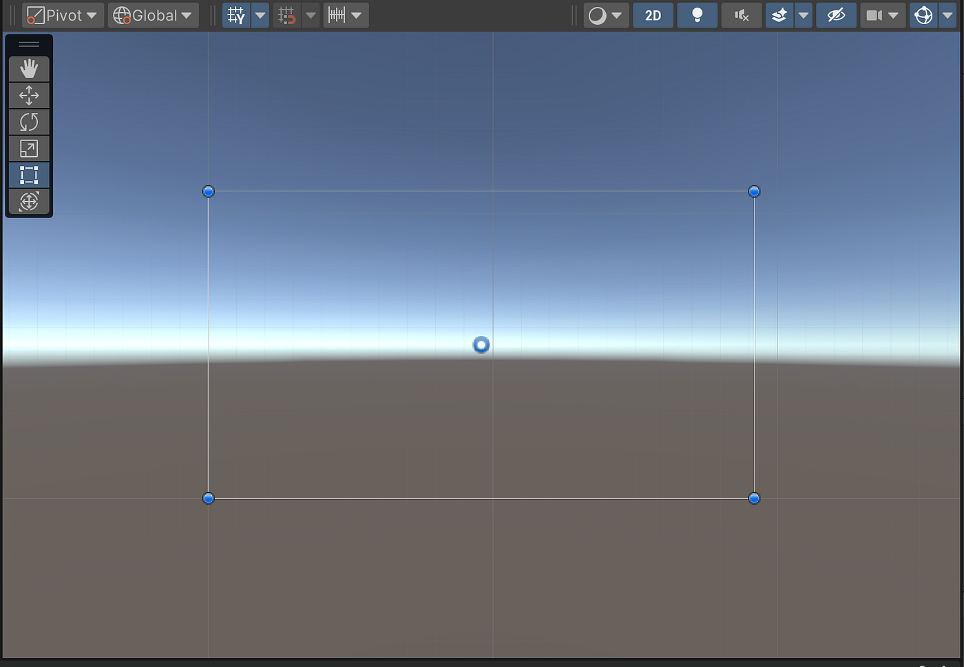
After creating our canvas, we now have an image like this on our screen and we can design and fill it as we wish:

If we think of Canvas as a frame, let’s move on to the basic UI elements that can be added to this frame.
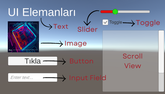
- Text: The Text element is used to display text on the screen. This is ideal for in-game messages, scores, game menu texts, etc. Properties such as colour, size, font, etc. can be customised.
- Image: The Image element is used to show visual content on the screen. This can be used for backgrounds, button icons, character portraits, etc. Properties such as texture, sprite, colour can be set. In order to add an image to the Canvas, the image file must be added to the project files. Afterwards, the image can be dragged to the Source Image section in the Inspector of the Image item or the file path can be written.
- Button: The button element is used for user interaction. It can be used to perform a specific action when users click it. Events can be assigned to be triggered when the button is pressed. Since text should be written on the button, it comes with the Text component. On Click() plugin is available by default. Which event will occur when the button is clicked is specified here by writing with Script.
- Input Field: The input field element allows the user to enter text. By default, it comes with a Text component and also a Placeholder where it can be specified what kind of information is desired. The expression to be written in this Text field can be for username and password fields, search boxes, form entries, etc.
- Slider: The slider element allows the user to select a value using a slider in a range of values. For example, it can be used for volume adjustment. Background, one of the components that comes by default, contains the properties related to the background of the slider bar. Fill Area contains properties that can be changed for the area where the value is increased when slid. Handle Slide contains properties related to the shape of the ball etc. used for scrolling. When it is driven with OnValueChanged event, what it will trigger can be written with Scripts.
- Toggle (On/Off Switch): The toggle switch element allows the user to switch an option on or off. This can be used in game settings, options menu, checkboxes, etc. By default it comes with a Background and a Label component where the switch name is entered.
- Scroll View: The scroll view element makes content scrollable within a given area. This can be used for long lists, text documents, loading bars, etc. The properties of the scroll areas on the right and below can be customised.
- Panel (Panel): The Panel element is used to group other UI elements or to create backgrounds. This can be used for menus, windows, grouping and organising. Layers can be created on the canvas. For example, let’s say we pressed the Stop Game button on the game screen. We can notify the user that the game has stopped with a panel where the screen is slightly transparent where the game is stopped.
We can see examples of these components in the screenshot below:

After adding these elements to our Canvas, we can proceed to editing. We can adjust the properties of the element we want to edit by clicking on it in Canvas or selecting it in the Hierarchy Panel. Among these properties, the most commonly used ones are position, size, rotation, colour and text content, if any.
We can create a hierarchy between these elements. In the Hierarchy section, using the drag-and-drop method, it is possible to sort them so that they are sub-elements of each other or one below the other. Or we can group them with one or more of them. Adding hierarchy in this way means that the elements are interconnected and work together.
We can also add animations to make our UI design more impressive. For example, we can play a specific animation when a button is clicked or when the mouse is moved over a text box. We can use the Animator component for this, or we can edit our UI elements with ready-made animation tools to add animations. Since the topic of animation is a very large and separate article, I am not introducing it here. I will be preparing an article about animation in the future.
Tips for a Good UI Design
1. Usability Orientated Design: When designing the user interface, it is very important to ensure that users can easily use our game. A simple, intuitive and consistent design enhances the user experience.
2. Minimalism and Cleanliness: We should avoid unnecessary complexity and excessive embellishments in the interface. A minimalist design allows users to focus and quickly find the functions they want.
3. Responsiveness and Compatible Design: Developing a design that is compatible with different screen sizes and resolutions is another important point. Responsive design allows users to have a smooth experience on different platforms from mobile devices to desktop computers. It would not be nice to say that the buttons on the right side of the screen are not visible when you open our game on a mobile phone, just play it on a tablet. :)
4. Colour Selection and Contrast: We should choose the colours carefully and use a high contrast design. In other words, when the colours in the design are compared to each other, there should be a significant difference between them. We should use colours to highlight important elements to make it easier for users to read the text, but for example, the text should not be light yellow on a UI screen where the background is white.
5. Text and Font: We need to carefully choose text sizes, fonts and layout. This is very important for the text to be readable and for users to easily understand the messages.
6. Visual Hierarchy and Layout: We can use visual hierarchy to emphasise important elements. For example, large headings, prominent buttons and other elements that need to be focused on can easily attract the attention of users.
7. Interaction and Feedback: We need to provide feedback in response to users’ actions. By providing appropriate feedback when they click buttons or fill out forms, we can ensure that users understand what they are doing. For example, if the action takes place when a button is clicked but there is no change on the screen, the user cannot be sure whether they clicked or not and a good user experience is not created.
8. Testing and Improvement: Finally, we should definitely test our design with real users and make improvements by taking feedback into account.
How to create a user interface, which elements can be added, what should be considered? I tried to explain these as much as I could. A user-oriented design is a very important issue as it will enable users to use our game more easily and enjoyably. I hope I have been useful.
Have a good work.
Selin.

Hiç yorum yok:
Yorum Gönder